
As the lead product designer, I led the end-to-end UX and UI redesign of proudP to address a critical data gap caused by low user engagement. Through user research, usability testing, and close collaboration with cross-functional teams, I designed features that made the experience more intuitive and meaningful, transforming proudP from a simple data-collection tool into an engaging personal health guide.
Lead Product Designer
Product Manager
User Research
Design Strategy
Design Systems
Product Management team
1 Front-end Engineer
1 Back-end Engineer
Business Team
Figma
Jira
Apple App Store Analytics
Adobe Photoshop
Adobe Illustrator
Adobe After Effects
2024-2025
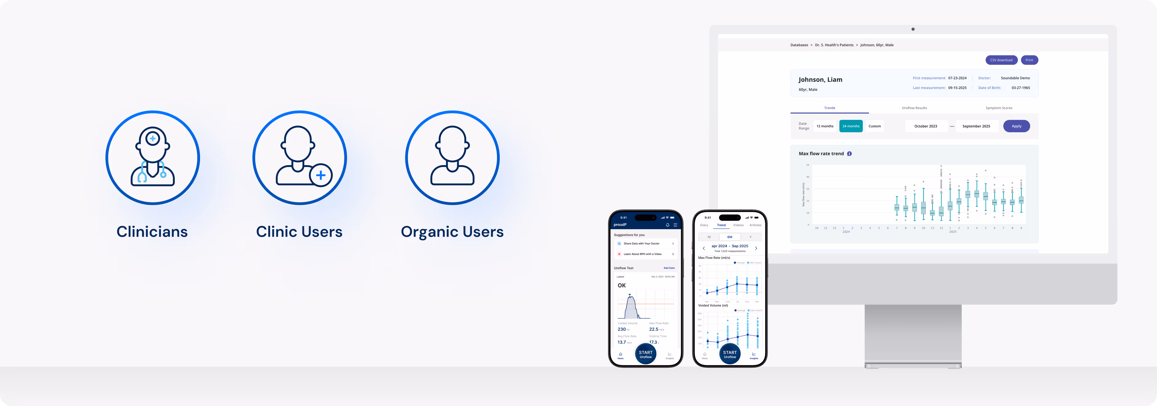
proudP is a personal urinary health monitor that analyzes the sounds of urination to provide clinical indicators of prostate and bladder health. It delivers clinically accurate results while offering a feasible and user-friendly interaction.
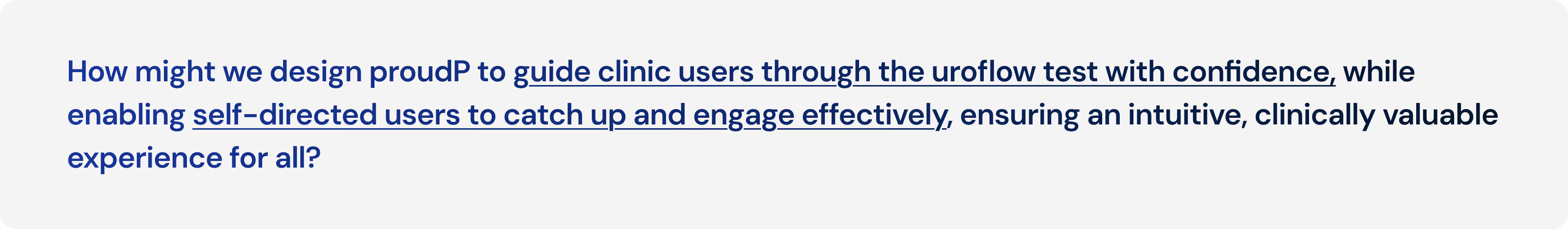
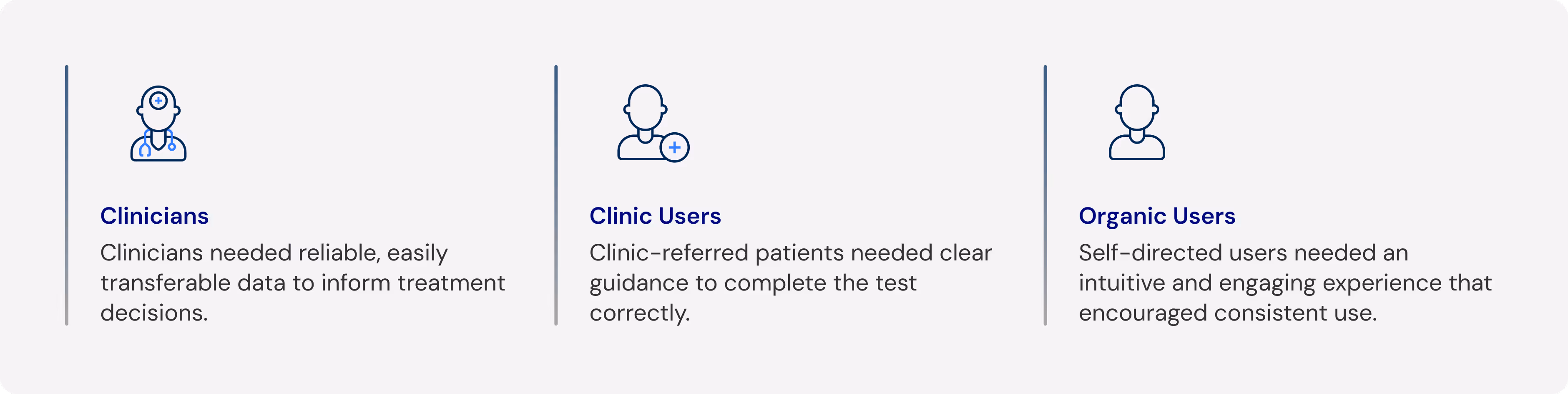
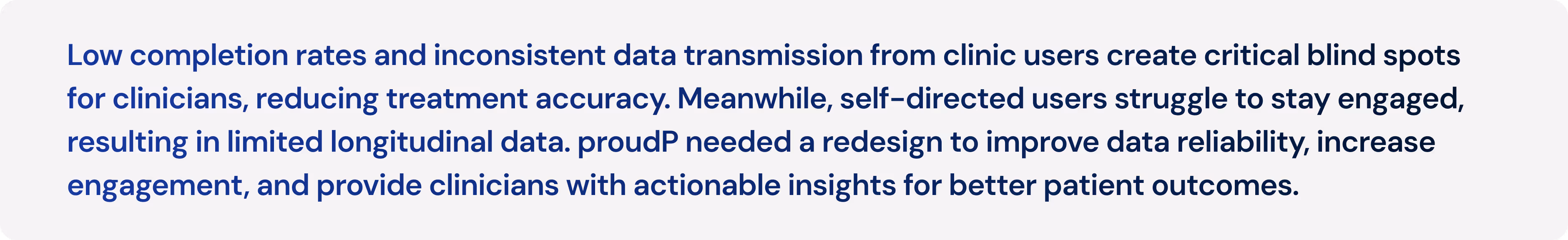
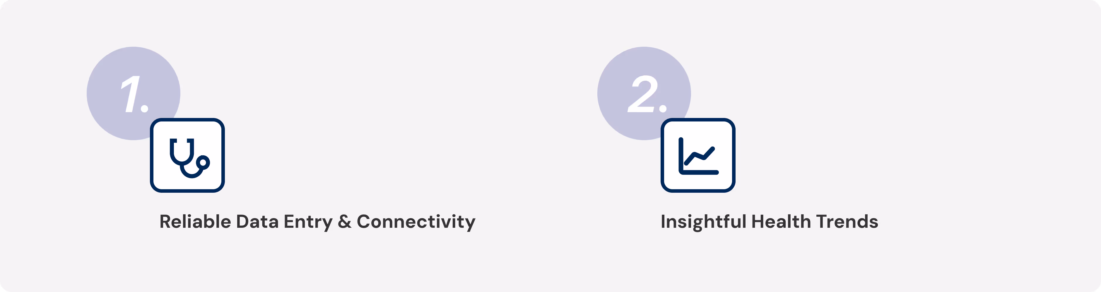
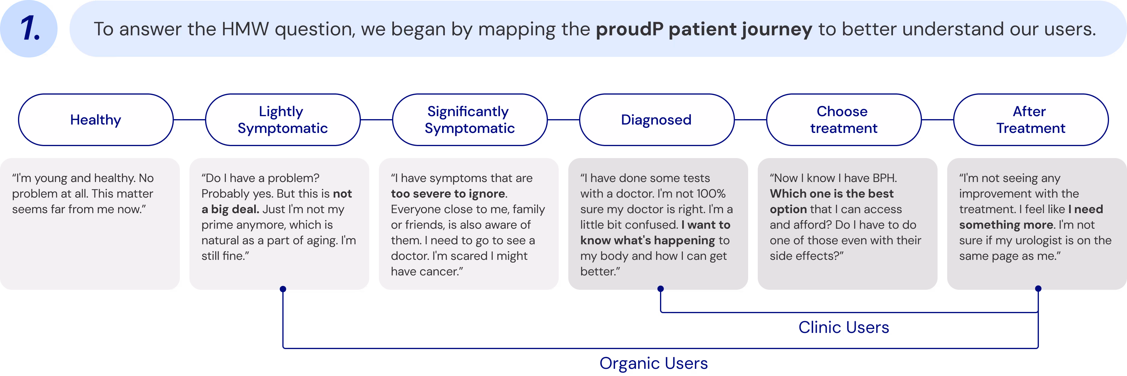
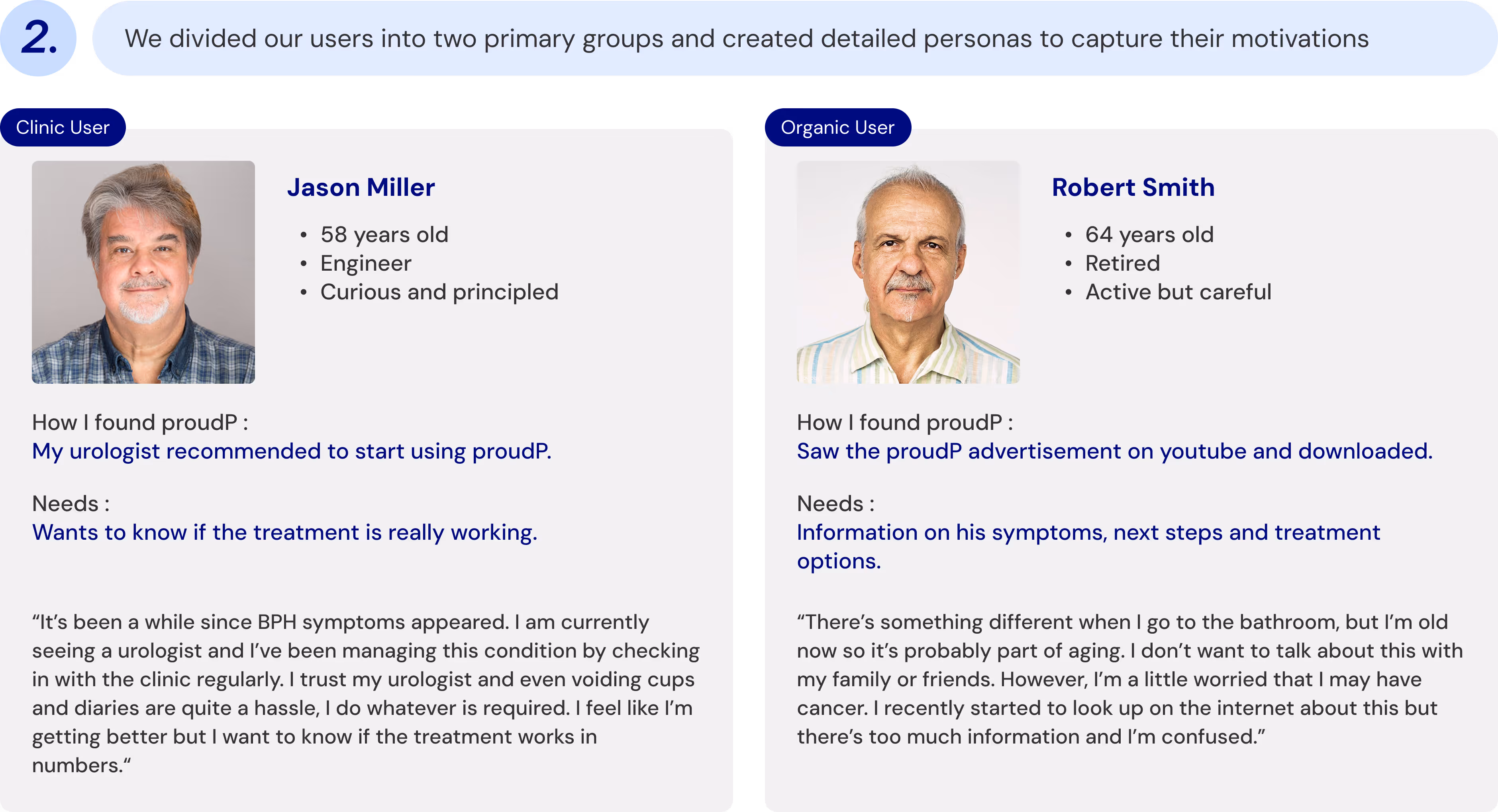
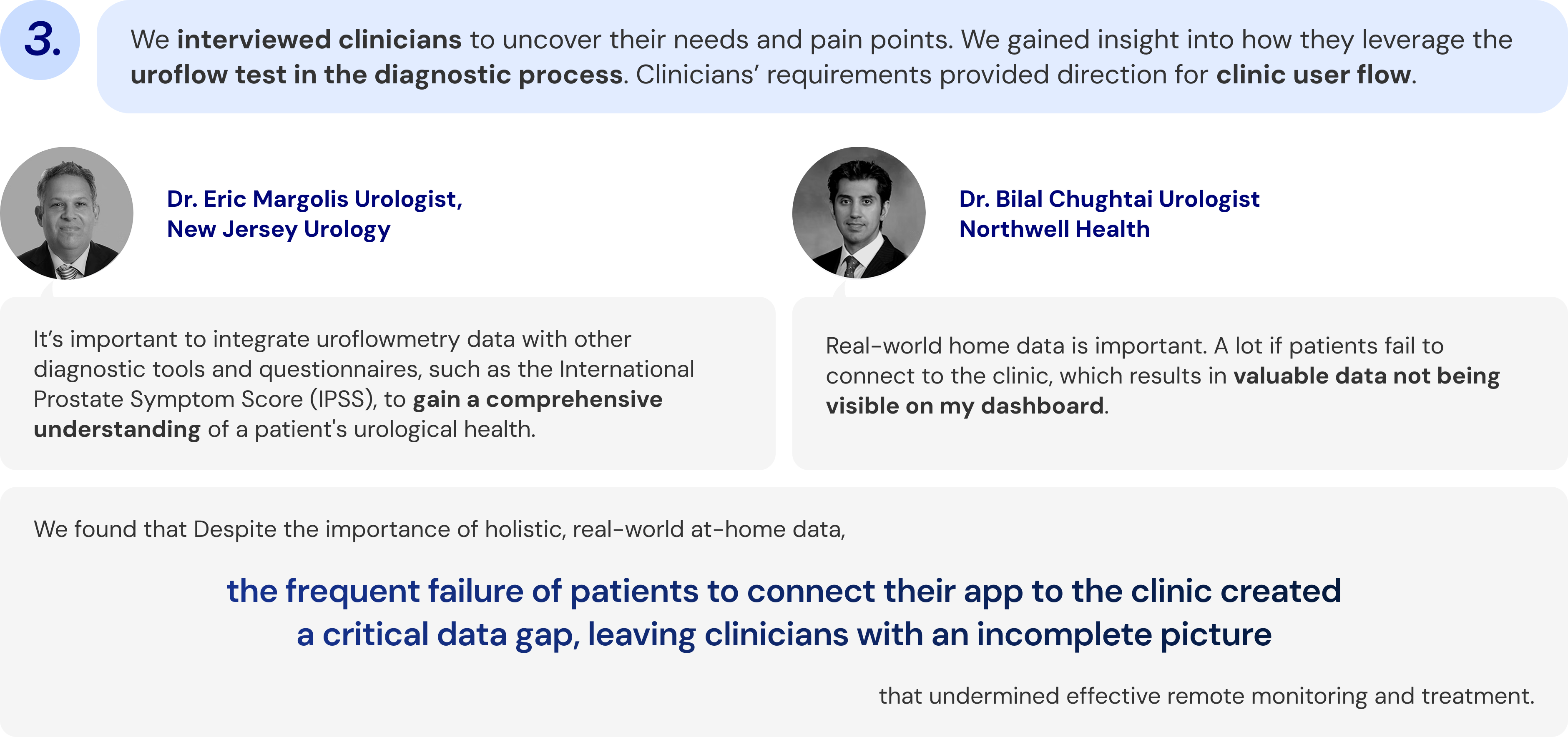
Based on our research, we identified that clinic users frequently struggle to properly integrate and transmit their uroflowmetry data and related health questionnaires to clinical dashboards. This failure leads to significant gaps in urological health insights, which in turn hinders effective treatment and monitoring. The renewed design approach focuses on two main objectives.

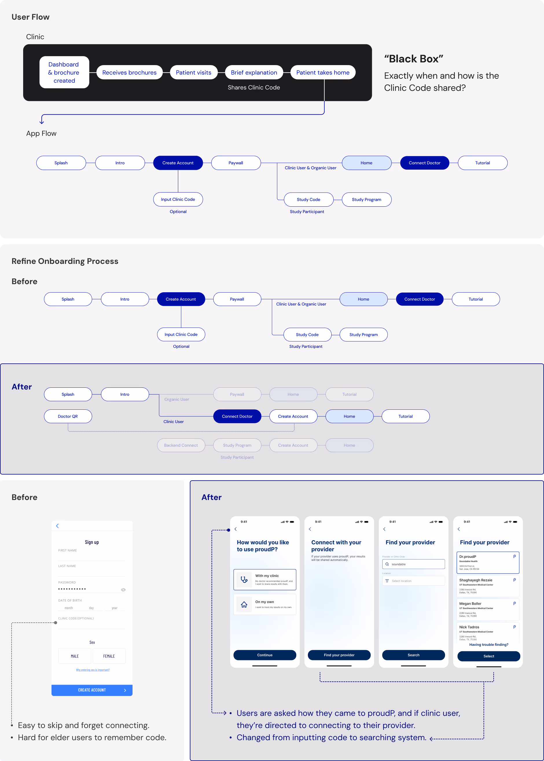
Connect to Doctor’ played a crucial role in our service since it linked the patients’ data to the clinicians’ dashboard. Often there were users skipping this part which resulted in patient data not appearing on the doctor's dashboard. Instead of QR code and clinic code, we refined the onboarding process and implemented doctor searching feature allowing patients to easily find and connect with their doctor by name or clinic.
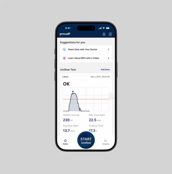
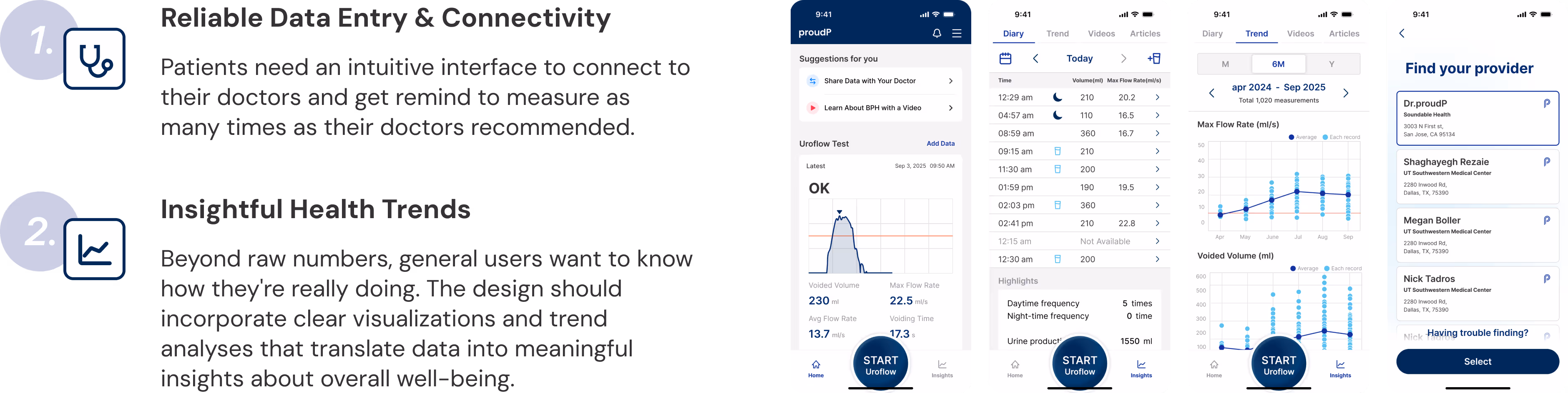
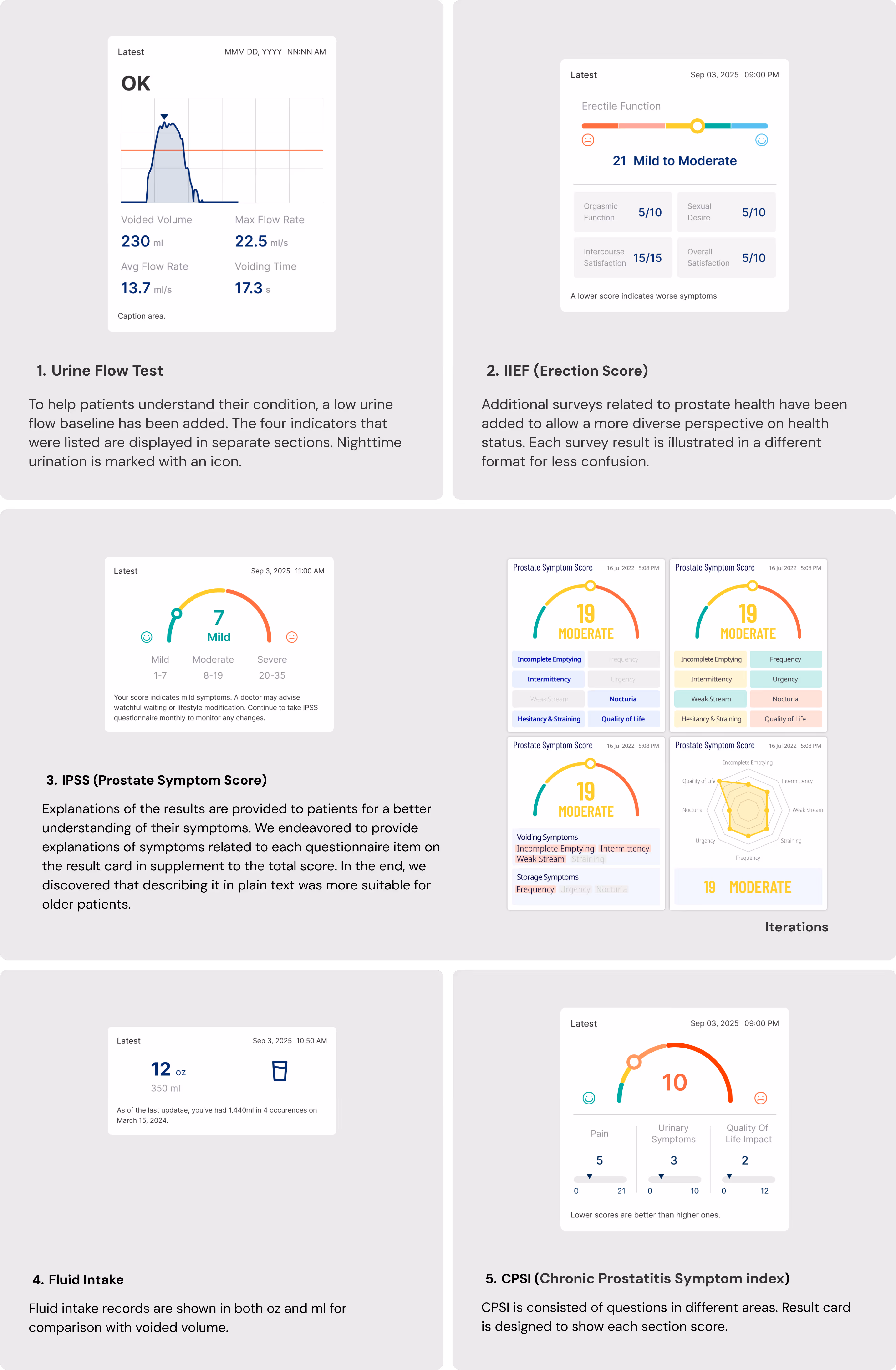
Patients complete various symptom questionnaires alongside the uroflow test, including IPSS, IIEF, and others. As these results tend to be forgotten after initial checking, there was a need to consolidate them into one platform for monitoring. Additionally, interpreting the results of uroflow tests without the doctor's explanation could be challenging for patients with only graphs given. Test scores often remain just numbers unless actively sought, providing limited insight. To enhance understanding each test result had a result card created with visual indicators and additional explanation.
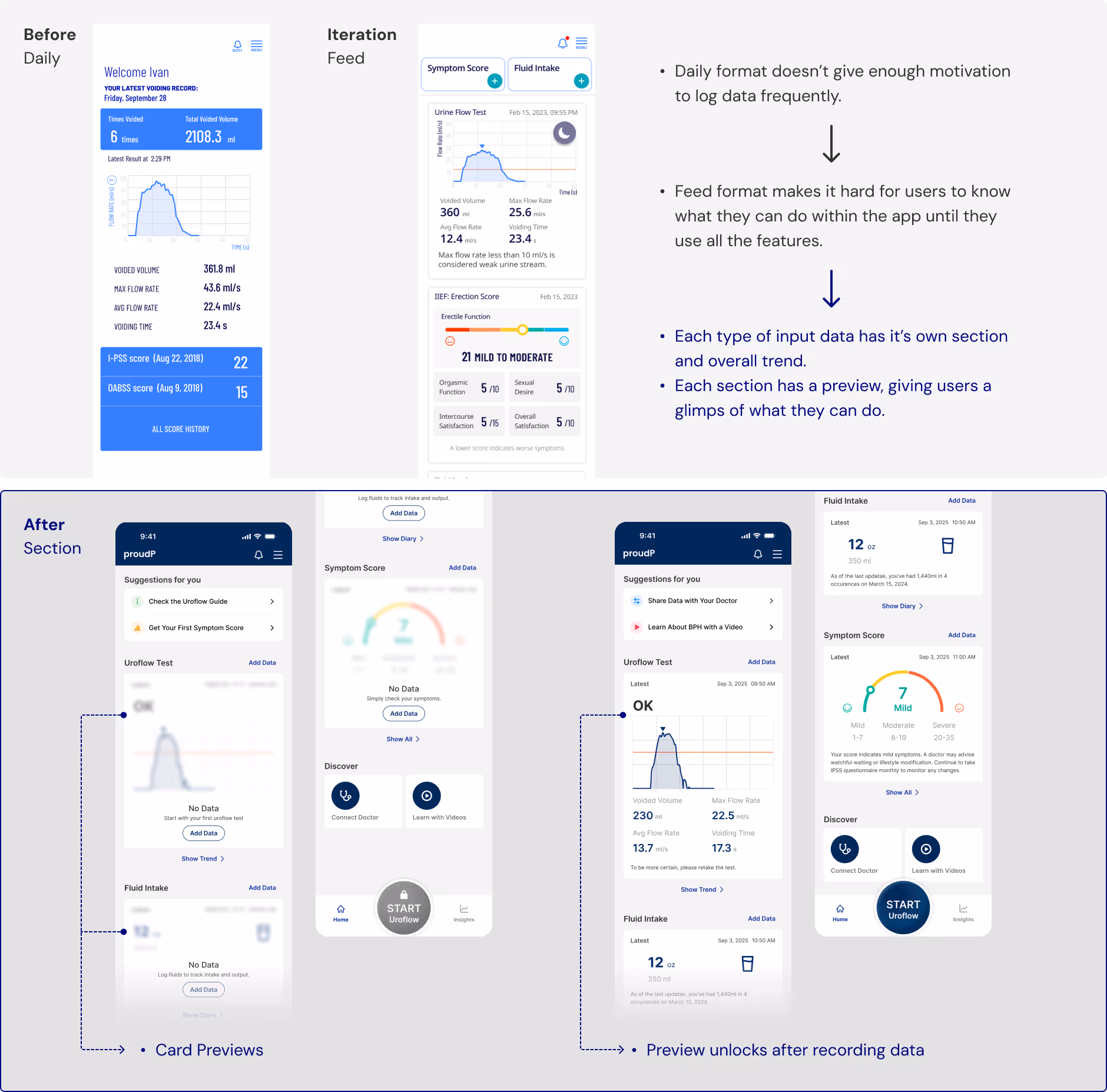
Instead of organizing data strictly by dates, we divided sections by their input data to allow users to focus on completing one section at a time. To spark curiosity, we had previews with a subtle blur to sections that were undone, inviting users to tap or hover to reveal more information, thus motivating them to engage further.
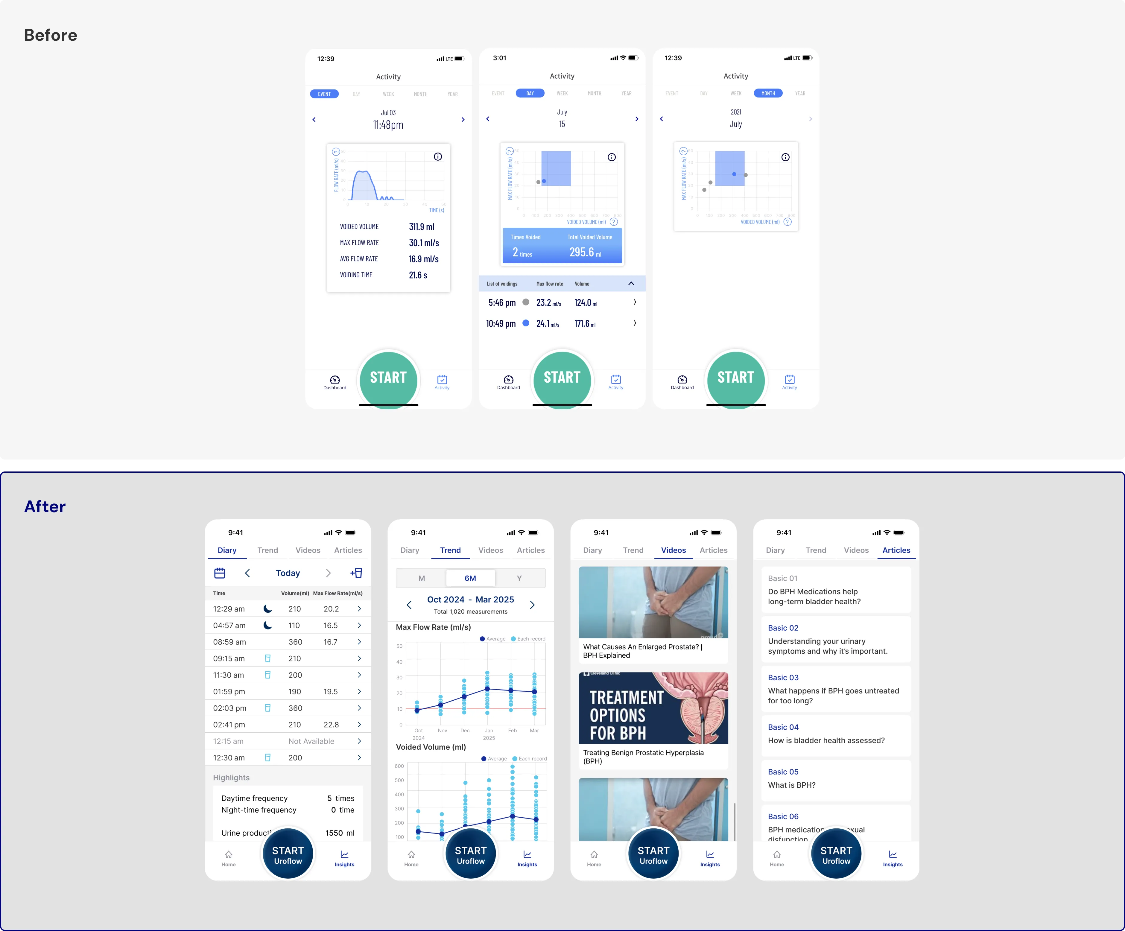
We have transformed the Activity tab into an Insights tab, providing a comprehensive view of bladder diaries, trends in voiding records, and educational materials. Previously, there might have been confusion between the contents that the Dashboard and Activity tabs contain. Now, all test records are neatly organized in the form of result cards on the Home tab, while the right tab serves as a dedicated space for in-depth information.
Collaboration between business and product teams in proudP
In our journey developing proudP, all team members were united in their commitment to improve our product's user experience that positively influenced our collaboration. However, the development process faced challenges due to alternating leadership between the business and product teams. This shift in leadership caused some inconsistencies in the direction of our product development. As we explored various market positioning strategies for our product, the emphasized features frequently changed, which may have caused confusion from a user perspective.
In retrospect, establishing a single North Star metric in line beforehand would have been beneficial. This unified direction could have ensured that both the business and product teams were aligned, facilitating smoother and more coherent product development.